

Best 5 Website Designs for Churches
We all need design inspiration once in awhile. Is your organization’s website in need of updating?
We’ve studied the latest in web trends and found sites that incorporate the techniques in original and innovative ways. Check out these sites from varying industries and find features that you can try on your web pages.
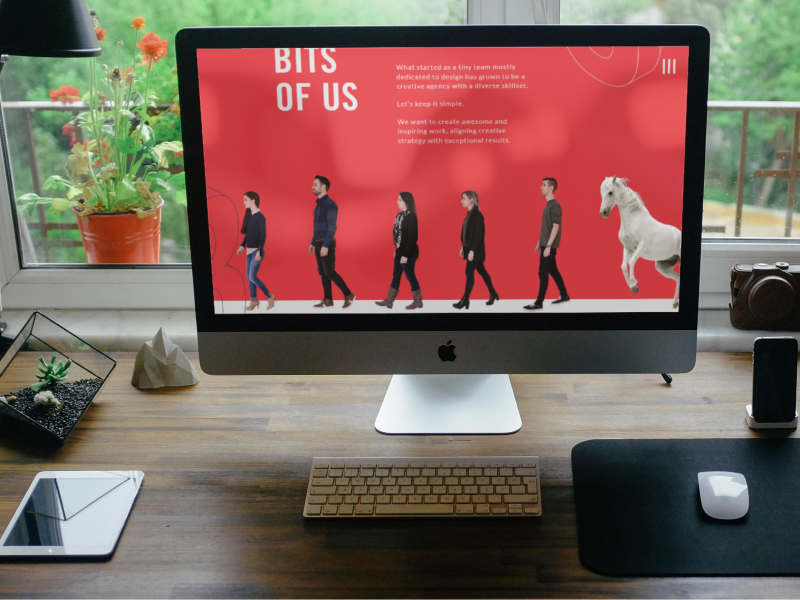
KOBU
Leave it to a design agency to hit it out of the park! Kobu has managed to harness almost every trend on our list, but in subtle and beautiful ways.
The webtrends found at Mockplus and TNW include bold and creative typography, use of art, asymmetrical layout, and many more. Kobu has managed to harness almost every trend on our list, but in subtle and beautiful ways.
This “Laboratory for Design and Digital Experiences” manages to, on their homepage alone, be minimalistic, retro, fluid, asymmetrical AND monochromatic. But most notable is their innovative use (or lack!) of navigation. There’s no typical menu bar, dropdown or section navigation. The home page has only three options above the fold:
- The left-hand landmark logo
- A “scroll down” director
- An unapologetic sideways hamburger navigation button
These kinds of design features would be great for churches who are high-tech and aesthetically bold and feel confident in their site visitors’ ability to navigate a non-traditional site. Whatever you do, be sure to take a look for yourself!
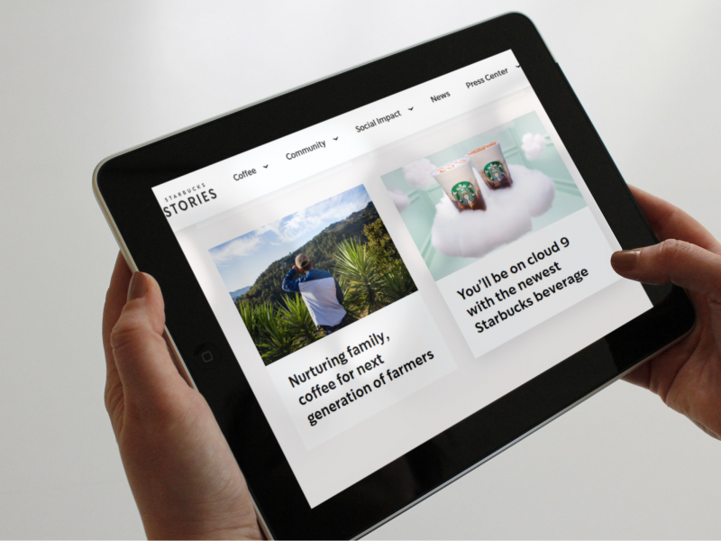
STARBUCKS
The coffee kingdom that everyone loves to hate, Starbucks’ website is branded, attractive and thoughtful.
Starbucks knows that a good story will appeal to the masses, and their customers want to feel connected and purposeful in their retail experience.
The News section is very easy to navigate using the beautiful optimized images and clear headlines, and the articles are curated for the customer base. For instance:
- Articles that shine a light on the sustainable coffee journey
- Behind-the-scenes progress and movement of the organization
- Biographical articles and related videos of loyal, interesting customers
Churches and organizations, take note! This is layout and direction would be a perfect way to communicate and archive news to your congregation or followers, and—most of all— highlight the journeys and personal stories of those impacted using these short bios.
You might like: 6 Smart Ways To Rebrand With Authority While Being Memorable
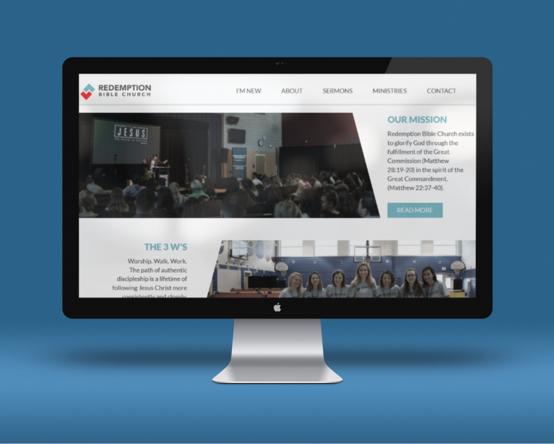
REDEMPTION BIBLE CHURCH
This Texas congregation is well represented at Redemption.Bible.
What could easily be a two-dimensional site experience, has been made into a relevant and updated product. The designers have embraced some very on-trend elements, like:
- Overlapping design & asymmetrical, broken-grid layouts
- Bold and creative typography
- Video
These applications make this Bible church’s website memorable and updated.
Want to incorporate some of these features? Start small by reimagining your home page, showcasing your next sermon series in optimized graphics, animation, or an inspiring video. Instead of leading with your name and tagline, hook your site visitors with this personal walk straight into the sanctuary of your church.
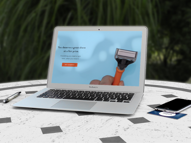
HARRY’S
Harry’s has set the bar in the subscription service industry, providing men’s shaving equipment online. On harrys.com, there is absolutely no question about the story they’re telling:
The hero is a clean shave, and they have just the right tools to supply it.
The use of art can personalize and soften an online presence, and background videos appeal to our highly visual culture. There are plenty of opportunities for churches to easily incorporate these elements into their congregation’s site, to spotlight a recent event or promote a new study or series.
Also, everyone can take a note from their use of trends like enhanced images, plenty of white space, and video background.
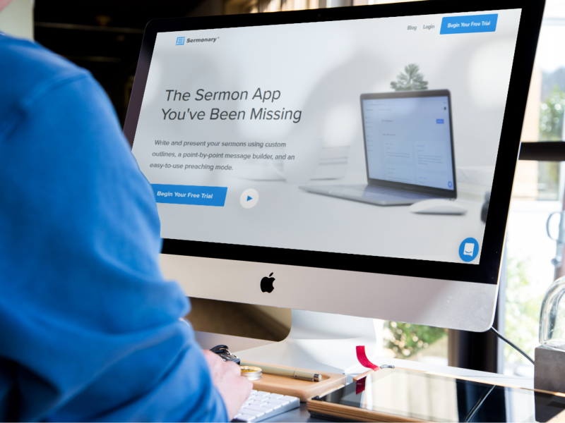
SERMONARY
Sermonary uses the latest software to help pastors write sermons. That doesn’t sound all that exciting, does it? But Sermonary.co has managed to make their process sound so necessary, easy, and even FUN, that you’ll want to jump at their call to action...even if you don’t write sermons.
Two site features are worth pointing out:
- The explainer video is smart and relevant. Because the product is software, a simple image or product placement would not be sufficient. The video does an excellent job of stating a case, describing the piece, and then calling to action.
- Speaking of calls to action, theirs is unmistakable. The “Start Free Trial” button is strategically placed so regardless of your site position, it’s calling you in.
Churches: What is your call to action? To visit on a Sunday? Listen to a sermon or see a clip? Message the Facebook group and become familiar with some of the attendees? Be sure to make it clear and visible from anywhere on the site.
Also, are your harder-to-describe ministries or concepts made clear on your website? Are you changing the structure of your kids’ ministry? Kicking off a new campaign? Having a quality video allows visitors to educate themselves at their own pace.
Learn more about Sermonary Founder: Future.Bible Podcast with Justin Trapp
Which of these elements can enhance your website?
Talk to your team about incorporating new design features on your site, in a section where you might need some clarity or updates. Make it a quarterly or bi-annual conversation and stay relevant.
What kind of design trends have you applied in the past year? How has it enhanced your user experience? Leave a comment and share with us your experience.